

The Accidental Accessibility Advocate
I've been developing software for a while now. I can remember back in the 1990s, before Smartphones, and before Azure and Office 365, and before most people had heard of the World Wide Web, everyone was getting excited about Microsoft Windows 95. Seriously, it was in the newspapers - some even had a pull-out section. So when we built a Windows calculator application we called it Calc95, and when a new version of Windows came out in 1998, called Windows 98, we updated Calc95 to Calc98.
It turns out to be a lot trickier than you'd think to write a calculator application for a computer. And back then there was no source control or test-driven development, and Kanban was something you'd only know about if you worked for a Japanese manufacturing company. But we had about four million users and we encouraged a lot of feedback so that, over the next few years, the number of bugs decreased to a trickle and Calc98 was pretty much done. But what was more interesting was some of the messages we got from users telling us how they had used the software.
Choice is Good
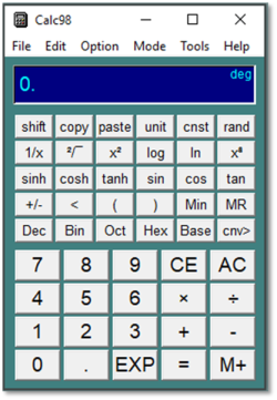
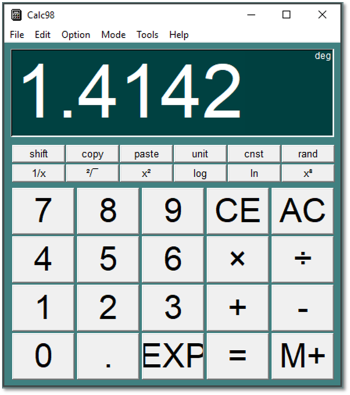
You see, we never quite managed to decide what the right font was, or button size, or even how many buttons there should be on the calculator. So we decided to make all those things configurable, because we could. The graphical user interface and the Win32 SDK made that possible. If you wanted to make the display font gigantic, with just a few functions on huge buttons, you could. We couldn't think of any reason why you would do that; but you could if you wanted to.
Solving a Real Problem
Then, to our surprise, we noticed we were getting a lot of email messages (and in some cases, letters - this was still the 1990s) from people saying things like ”My father is a retired engineer and suffers from dementia…”, or ”I teach special needs children…”, "I work in adult care...", ”I am 83 and have limited eyesight...”. All of these people had found ways of using Calc98's button sizes and fonts to either simplify the application or make the buttons and legends and display bigger, or have higher contrast. Without even meaning to, we had built something that helped people that, to be honest, we hadn’t really thought about. People with dementia, people with special needs children, people with partial sight. Completely by accident we had made an accessible application.
And so we doubled down on accessibility features, because it turns out there are a lot of people with accessibility needs. Not just people registered as disabled in some way, but also people with marginal eyesight, or who don't want to have to get out their reading glasses, or just need a little extra help. Big buttons help if you have any kind of physical or motor impairment, but also if you have gloves on or you have to work with a small touchscreen.
We discovered, accidentally, that incorporating these design details and giving users these choices made the software a better product overall. In my experience, users with accessibility needs don't really want a special application, they just want to be able to adapt it to their needs. They don't mind spending some time setting it up, as long as these custom configurations are possible.
Even in the 1990s there were hundreds of calculator applications for Windows. And yet ours became one of the most popular, with millions of installations. I am sure that its success was due to the accessibility features we introduced, even if it was largely by accident.
Welcome to 2020
Well, now it's 2020 and it shouldn’t need to be an accident any more. You don’t have to be “woke”, and you shouldn't need to have a legal obligation to persuade your company to take accessibility seriously. It's not just a case of ticking a box or doing the right thing. It really is just sound commercial sense to be able to serve the majority of your market who will either have an accessibility need now, or will have one in the future. And I would go further and say that if your applications and web sites aren’t accessible then you’re creating software that probably doesn’t work well for anybody, and apparently nobody wants software that sucks.
In more recent years I've worked on numerous software projects, many of which that had accessibility needs, especially public-facing websites. For a few years I was the SharePoint Architect for the website of the NHS in the UK (back when building public-facing websites on was a thing). Meeting WCAG-AA standards with SharePoint 2007 wasn’t easy, and in many cases we had to resort to re-writing the page and fixing everything up. Nowadays, SharePoint has much better accessibility support, and fortunately there are many tools and accessibility checkers available to make the task easier. I list a few at the end of the article
But it's an ongoing battle. It's very easy to spend a lot of resources getting a website or application to be accessible, and then neglect that as development continues, so that by the time version 3.5 is released there are accessibility problems again. You need to keep running the accessibility checks and periodically review the list of good practices, or better still, make accessibility part of your development toolkit.
Research continues
As time goes by, there is more and more research and advice on how we can make things better. Here's the relevant section of the settings page of another of our applications: Dictionary (on Windows 10):
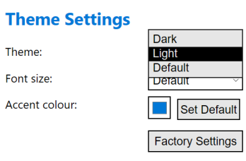
As you can see, we've given users a choice between the "dark" and "light" themes, and also an option to take whatever the operating system default is. You can also change the font size and accent colour, but not the individual text and background colours explicitly. And now an email from a user:
"I was reading the settings information for your app. I noticed that was available a background feature. I was unable to find those directions. I would like a background for easier reading because I have Dyslexia."
Oops! We didn't give people an option to subtly change the background colour, because it never occurred to us that somebody would need to. But recent research suggests that users with Dyslexia can benefit from having black or dark grey text on a pastel background, rather than black text on a bright white background. Although contrast is generally good, there are actually cases where you can have too much contrast.
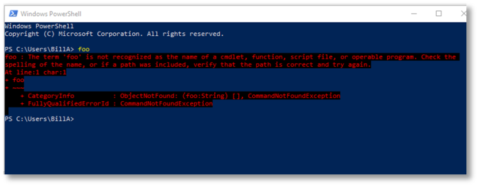
You can also have the wrong type of contrast. As time has passed, like most people, I find using a computer screen more of a problem. I need to wear glasses, but then I need to get too close, but if I take them off I'm leaning back, or I can't quite read the text. One of the worst problems I have found is command windows that often display error messages in red against a black or dark blue background. I find this almost impossible to read without making the font size unmanageably large, and I still haven't found a way of configuring it in a satisfactory way.
Still Learning
I went through a phase of thinking we shouldn't over-complicate application settings pages. But now I am of the view that we should err on the side of offering more user options for controlling the user interface. By giving users the ability to customize, you give them the power to make changes according to their individual needs, without trying to second-guess what those needs might be. You can't tell somebody what they need to make their life easier - you just don't know. Sometimes they don't know. Give them a choice so they can try different options until they find one that suits them. Sometimes just putting the user in control, in itself, is a great way of helping users. Give people a choice, and even if they ultimately decide not to take advantage of that choice, that's fine.
Accessibility is rarely "done". It's a continuous process of improvement at the software level, but also at the individual level. We owe it to ourselves to get this right, because it makes commercial sense, because it makes the world a better place, but also because the people who need this technology the most might well be our future selves.
Resources
- Home Office posters: https://accessibility.blog.gov.uk/2016/09/02/dos-and-donts-on-designing-for-accessibility/
- List of accessibility testing tools: https://docs.microsoft.com/en-us/microsoft-edge/accessibility/test?WT.mc_id=M365-MVP-5002401
- Accessibility checker in Office: https://aka.ms/officeaccessibility
- Accessibility Insights: https://aka.ms/accessibilityinsights
- W3C Web Accessibility Initiative: https://www.w3.org/WAI/fundamentals/accessibility-intro/
- A11y heuristics : https://www.deque.com/resources/intro-to-accessibility-heuristics/
- WCAG: https://en.wikipedia.org/wiki/Web_Content_Accessibility_Guidelines